ARCO
Visual Identity System.
Distilling its image, redefining its essence
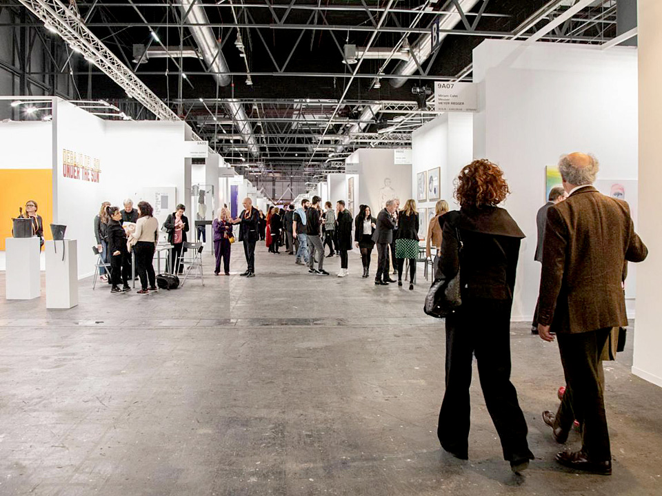
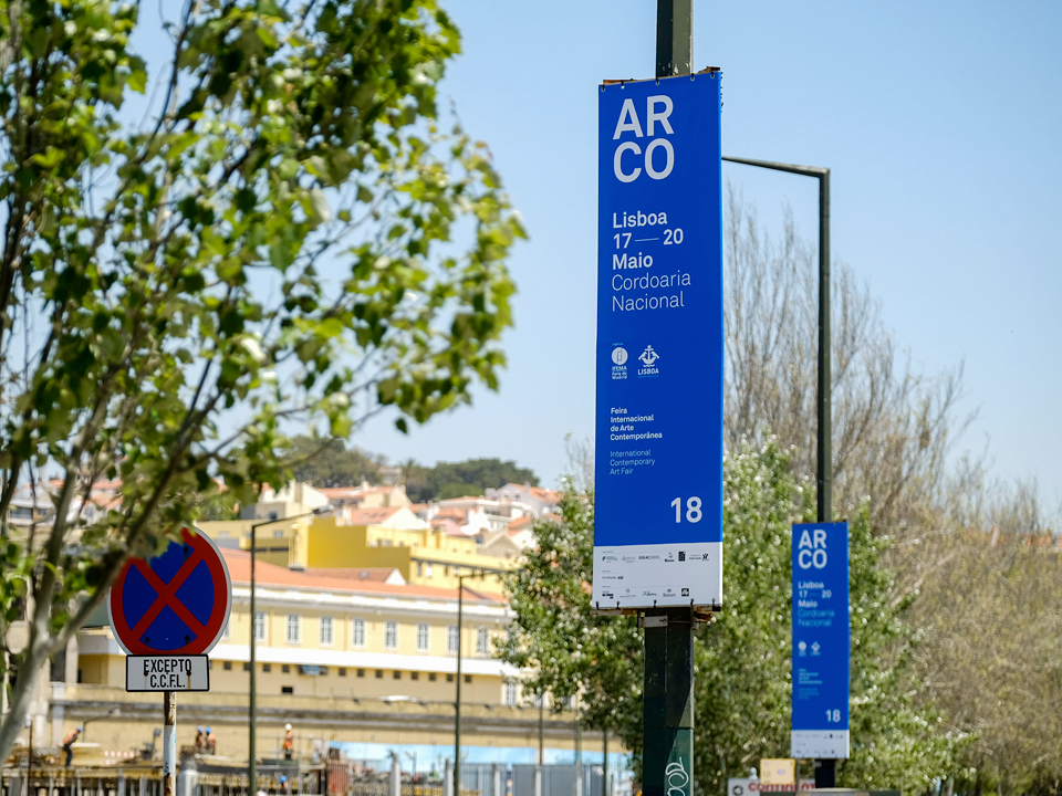
The ARCO International Contemporary Art Fair is one of the main contemporary art fairs of the international circuit. Organized by IFEMA (Fair Institution of Madrid), it is held annually in February in the Spanish capital, and since 2016 also in Lisbon. ARCO was born as a gallery fair with the intention of gathering an artistic offer that went from the historical avant-garde to the most recent emerging art, through modern art and contemporary art.

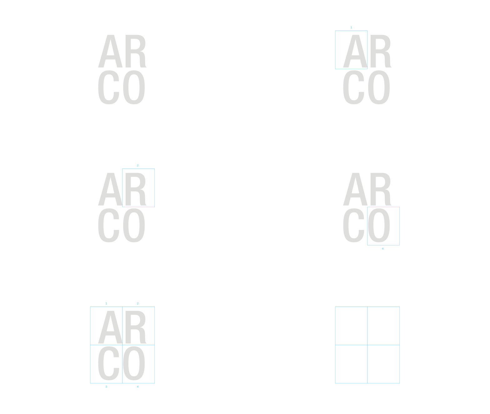
Structure of four
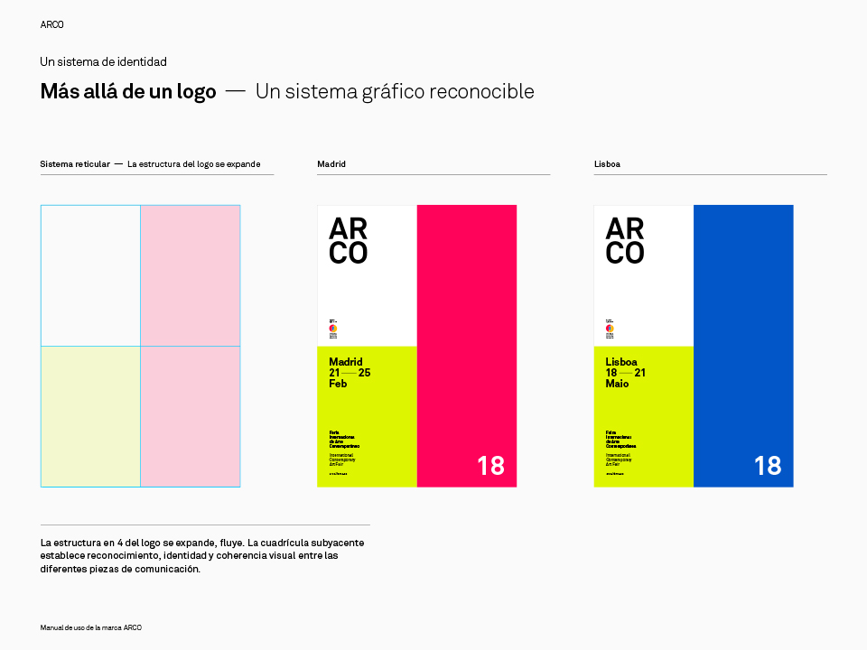
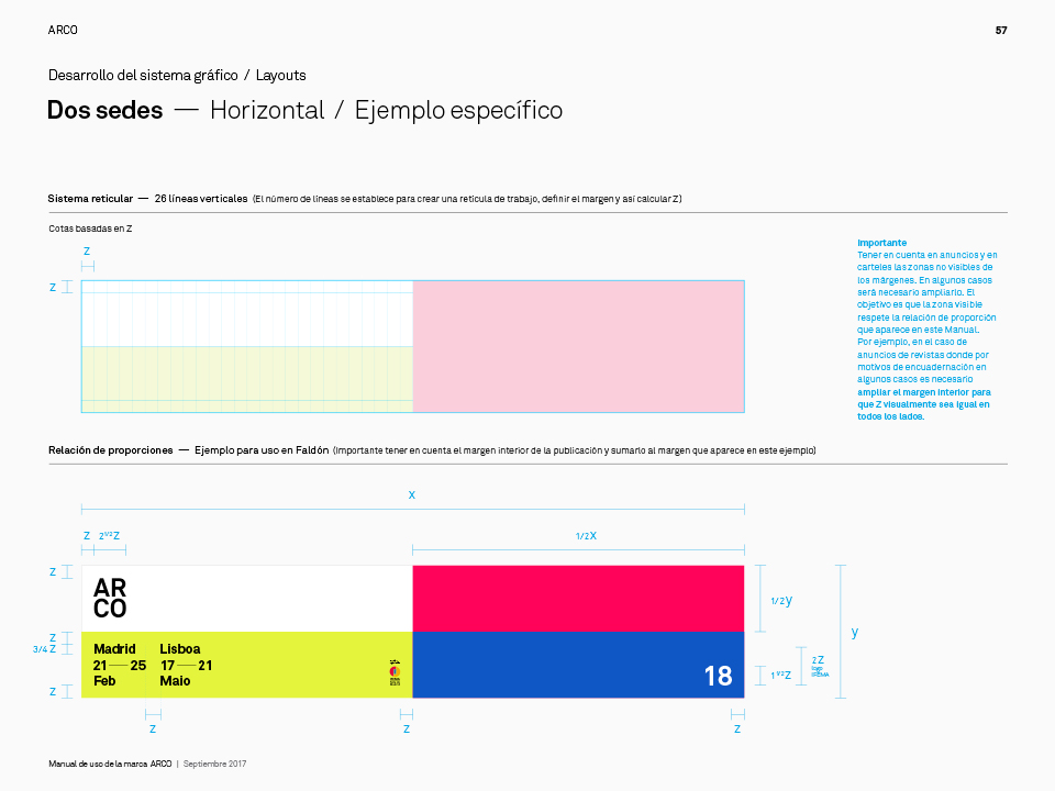
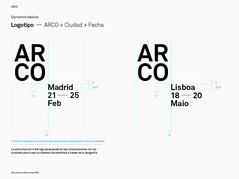
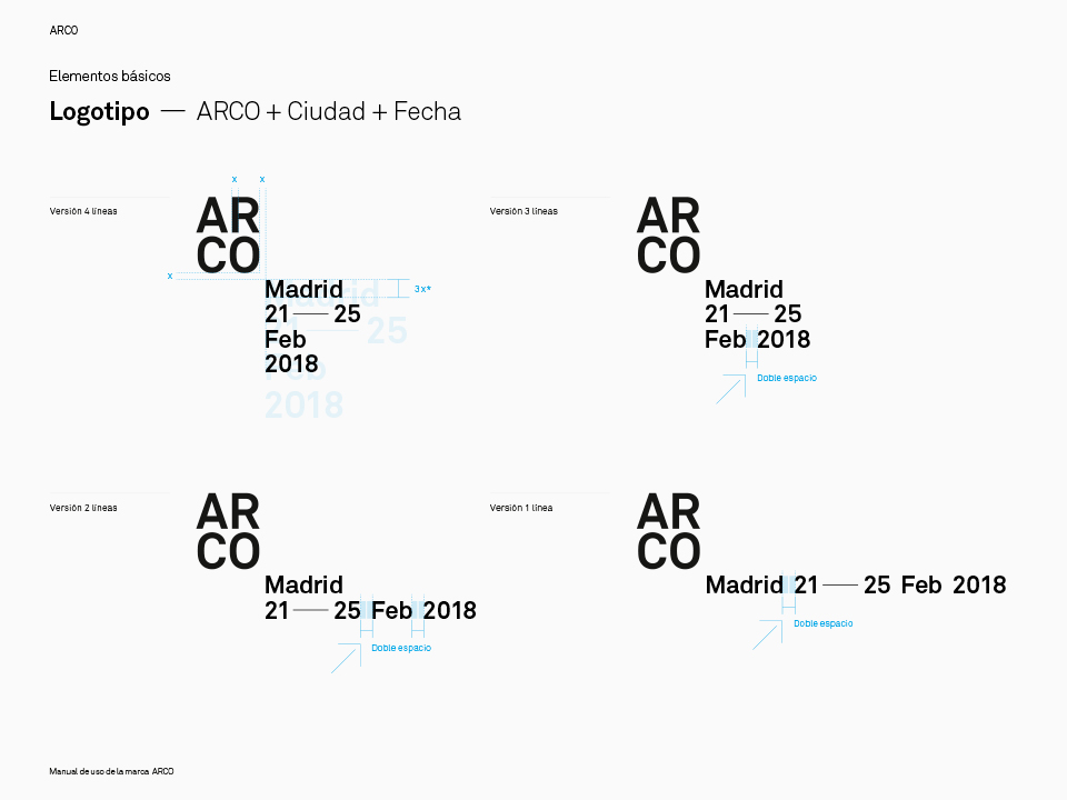
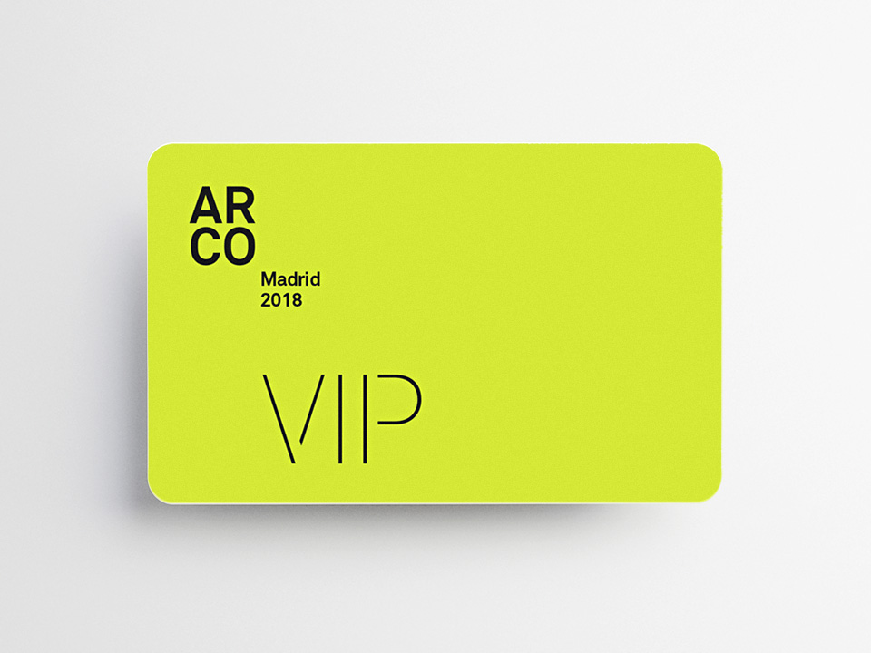
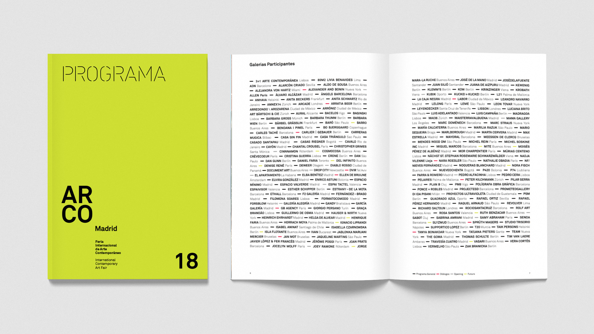
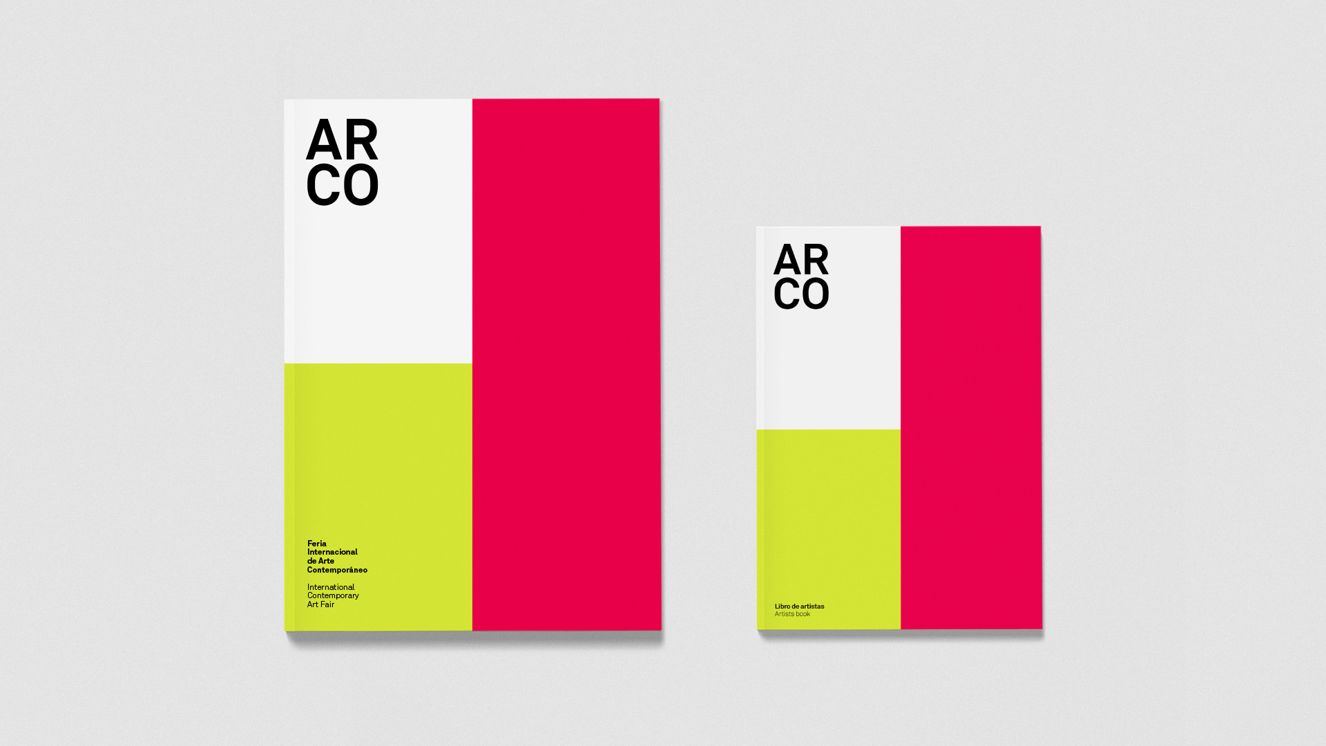
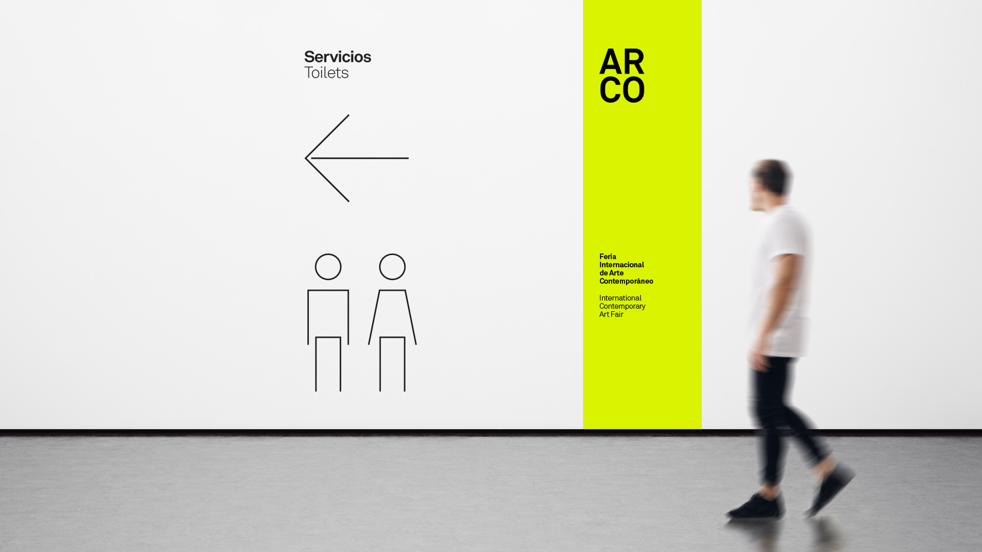
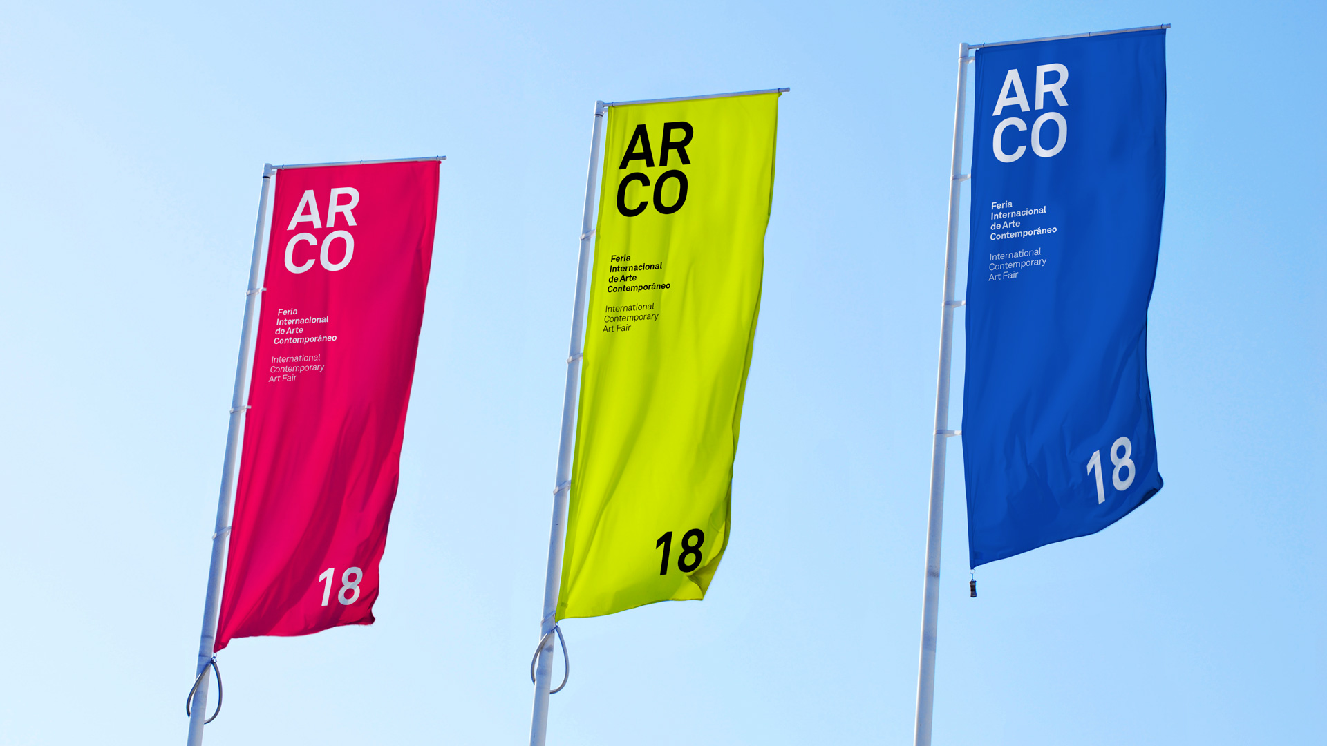
Essence or visual reminder of the history of the ARCO brand. To build the Visual Identity System, we first looked at what had been built so far, we distilled the essential graphic attributes and established them as the core of the brand identity. The four-element graphic structure has been a visual constant in the different editions of the fair.
Font update
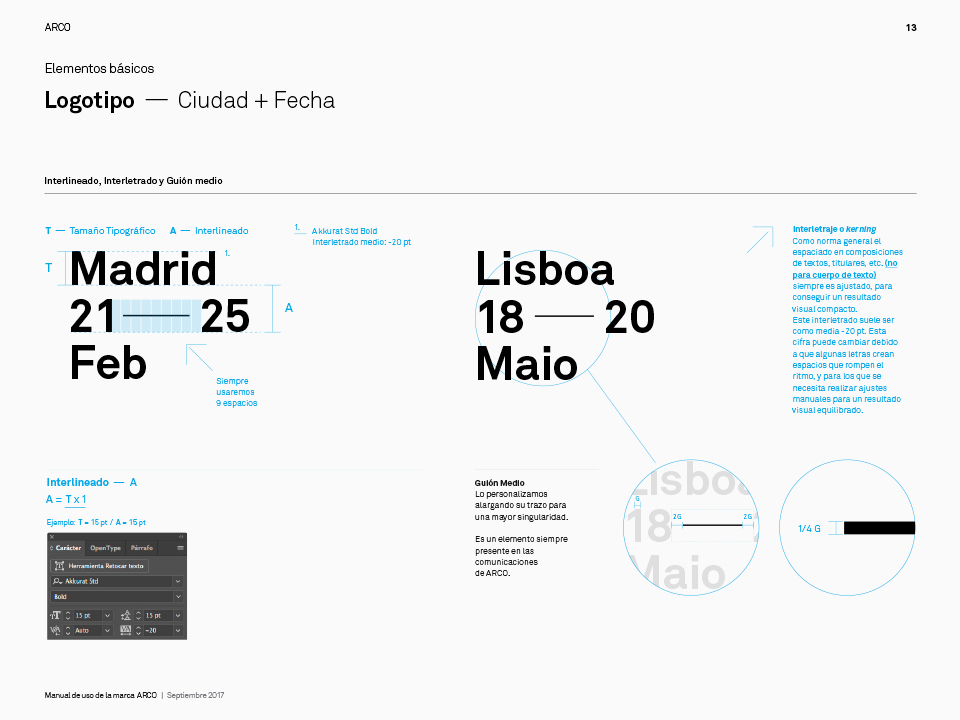
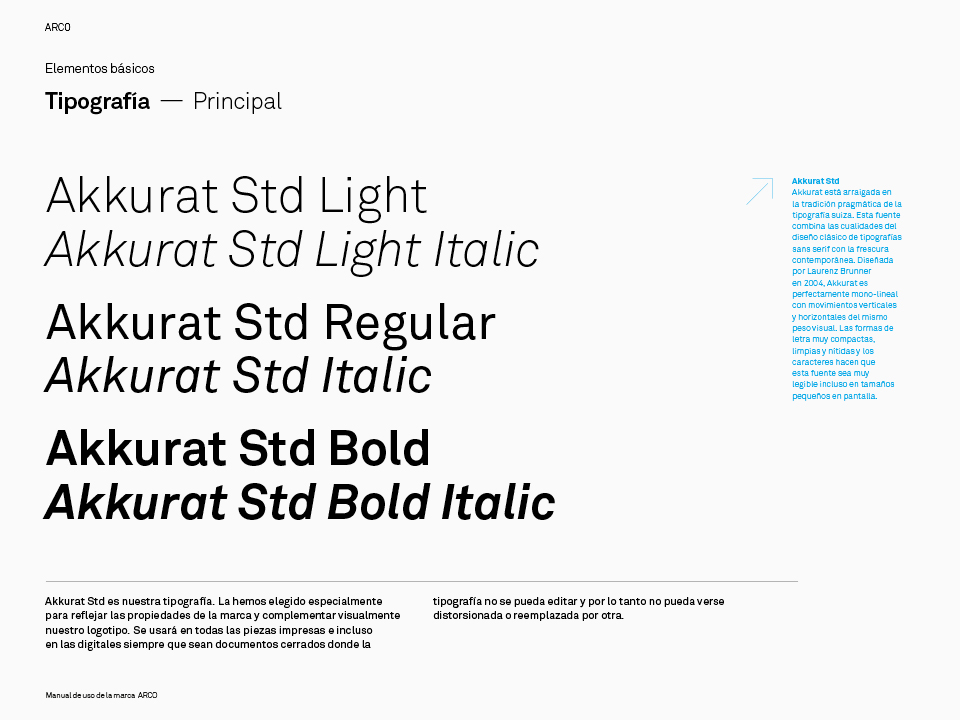
A typography, more solid, stable, and timeless with clean strokes that integrate in a balanced way into the visual identity system.

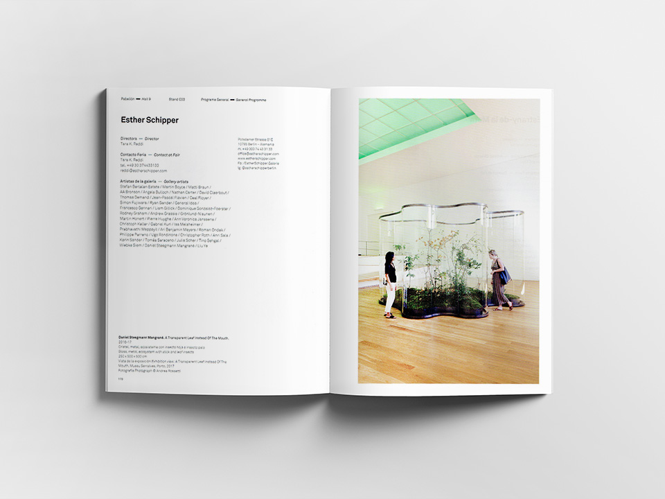
Coherence, continuity and visual structure
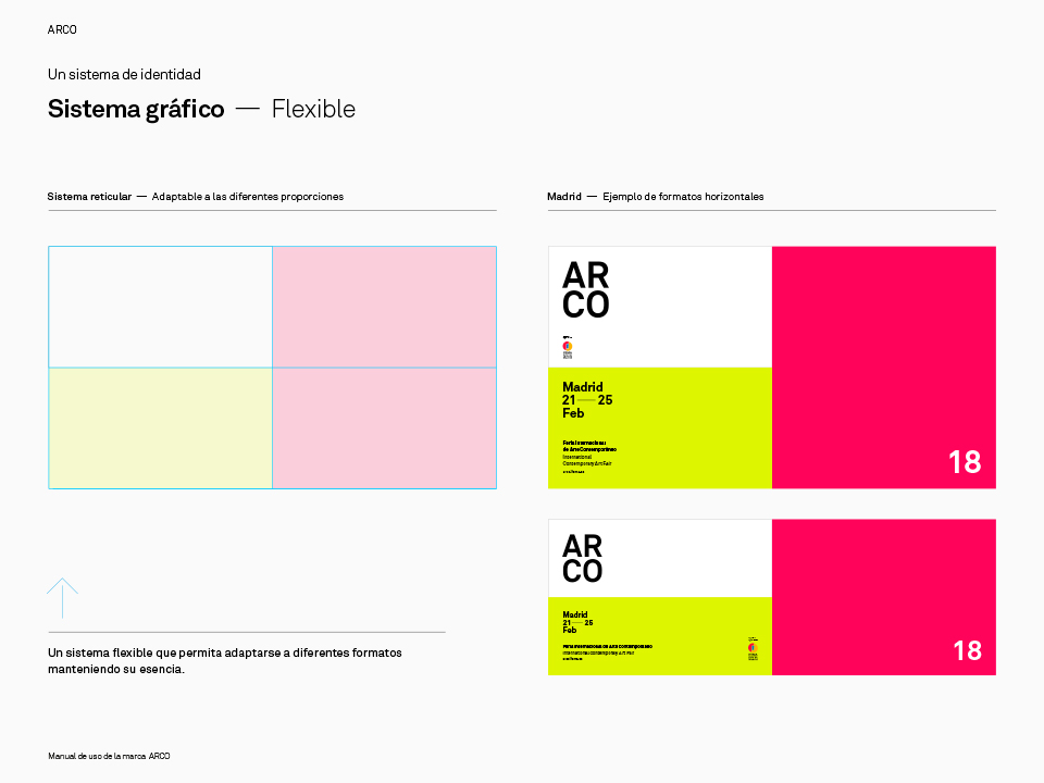
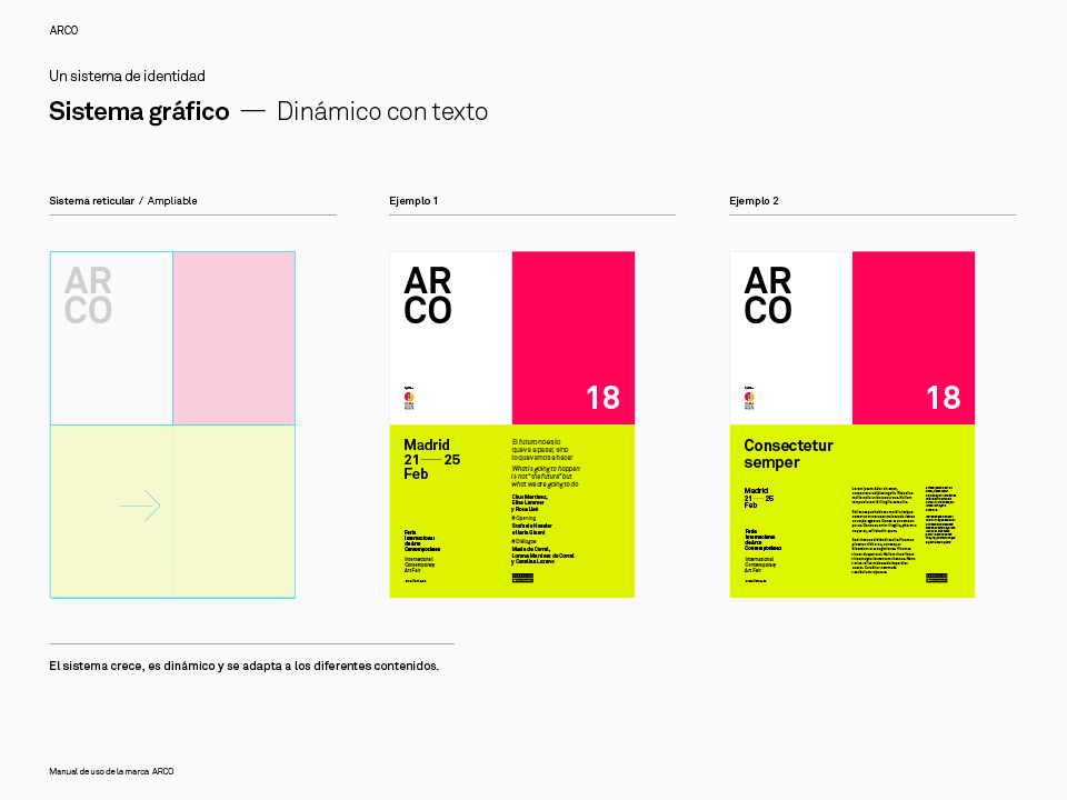
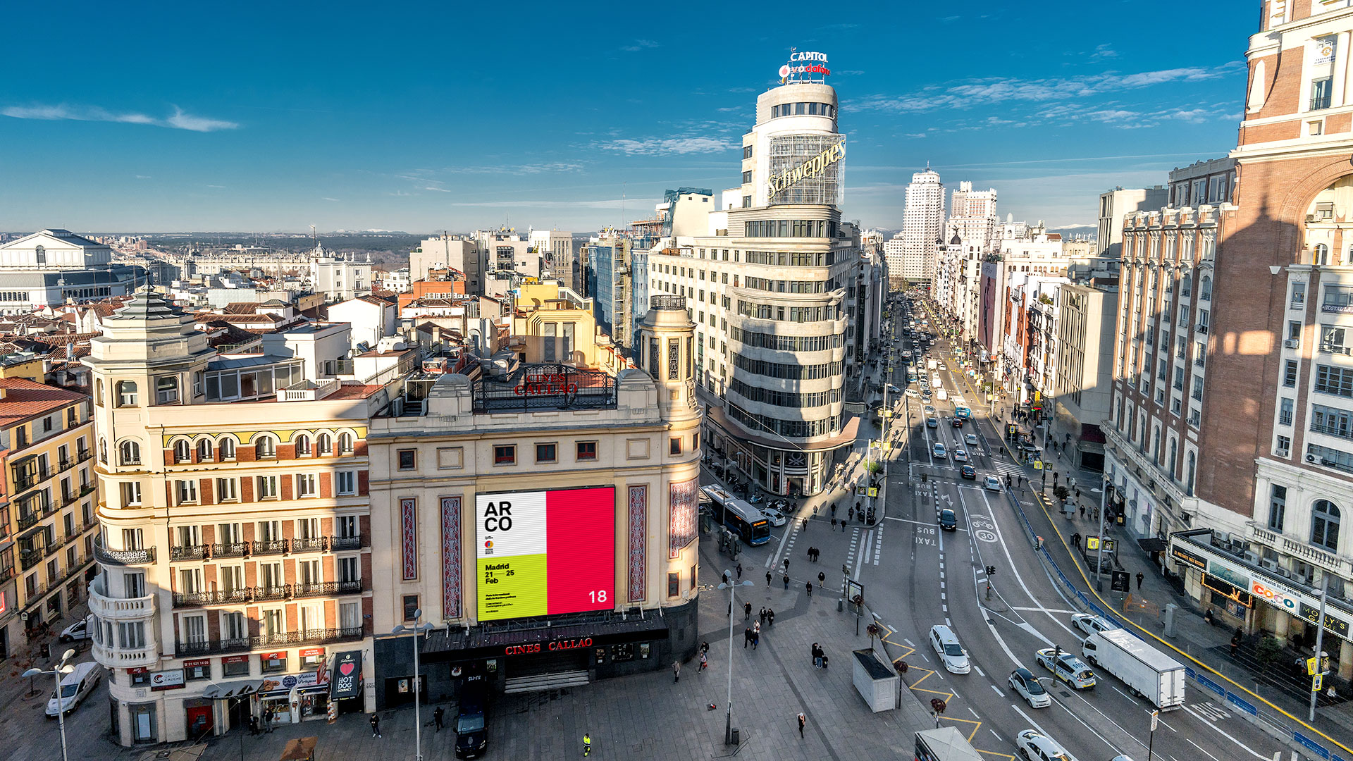
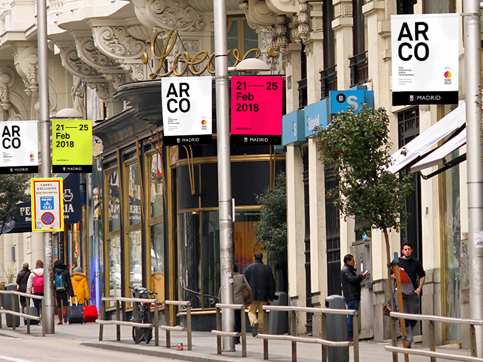
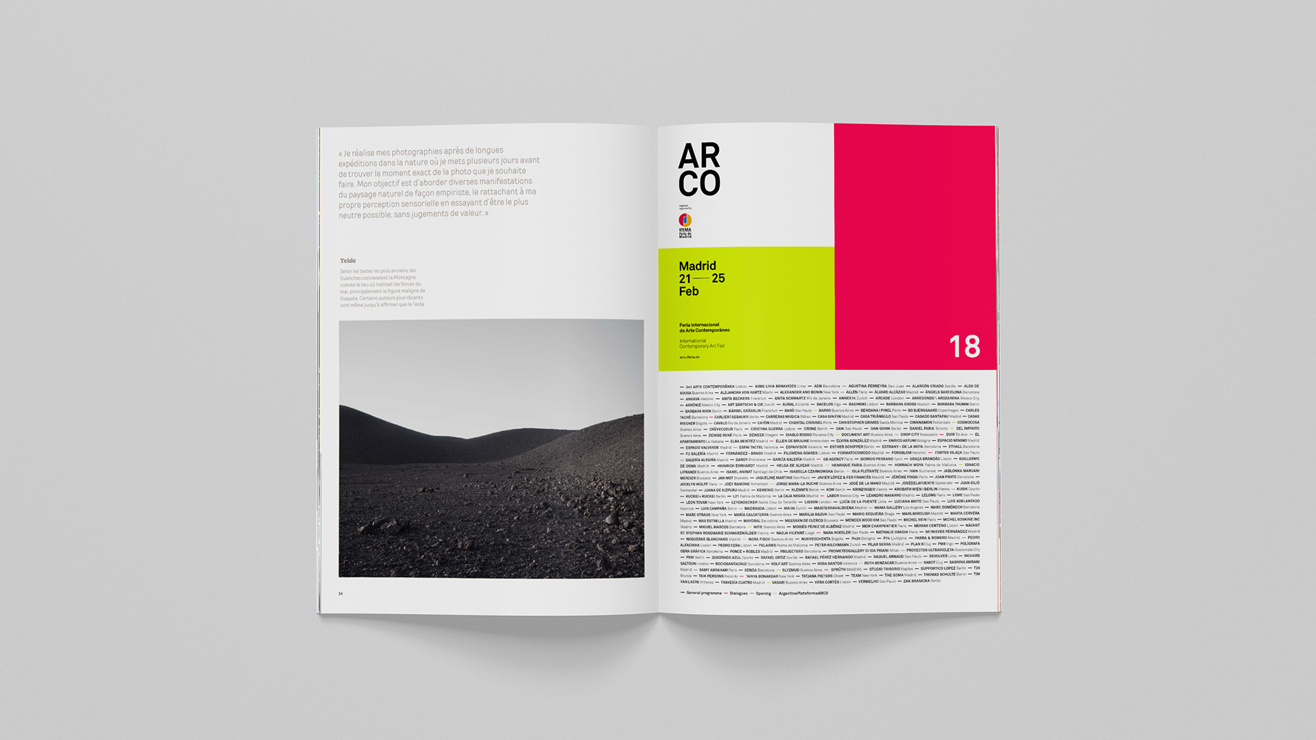
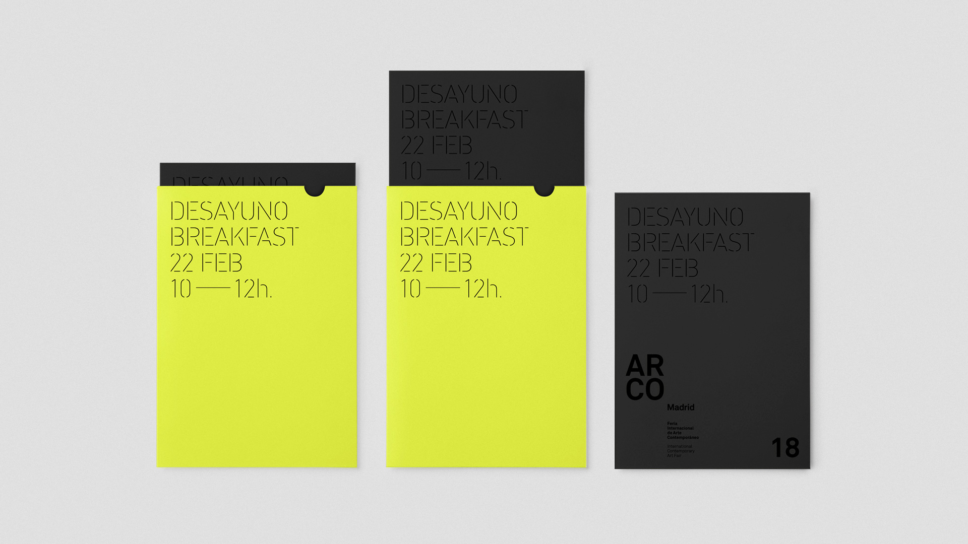
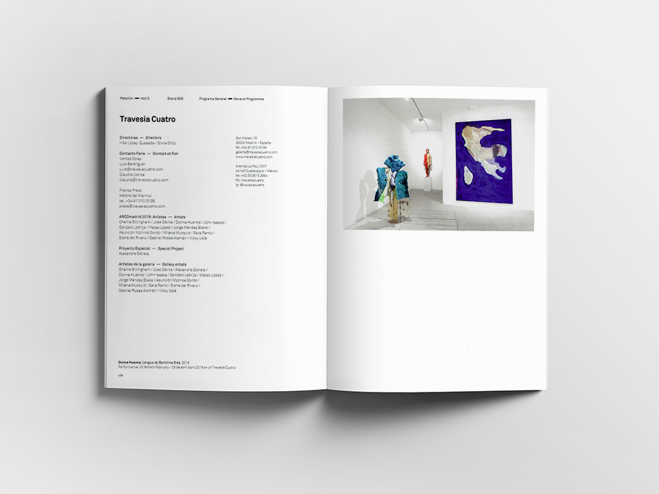
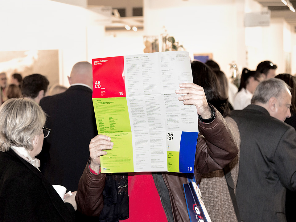
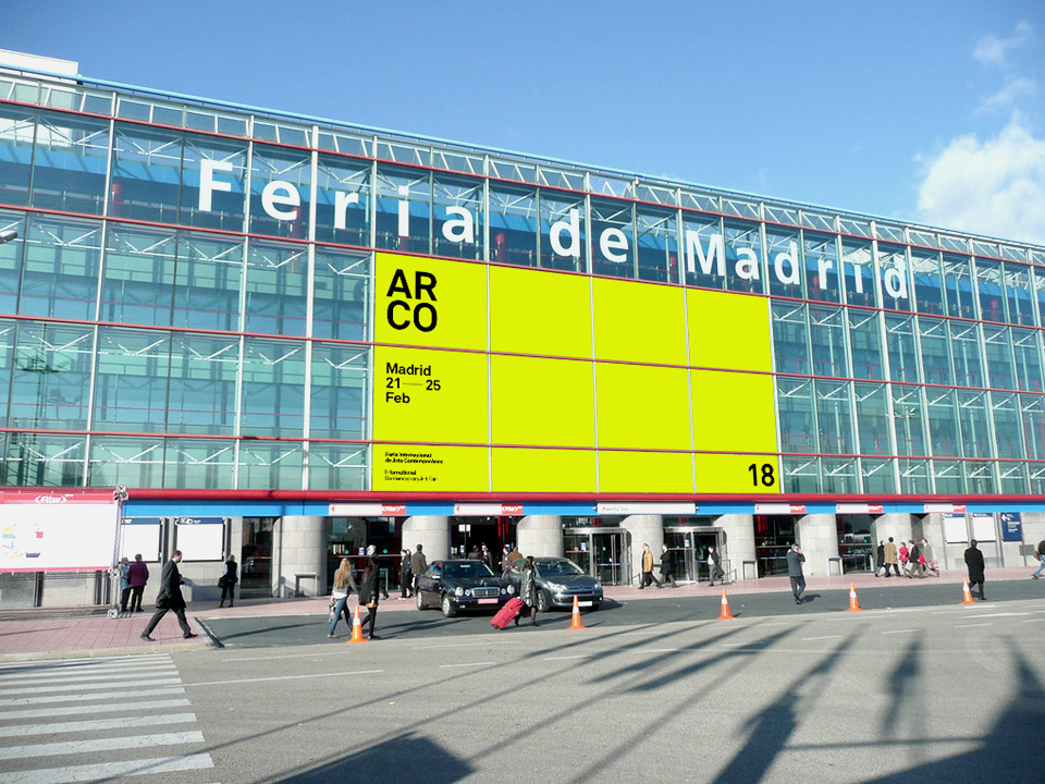
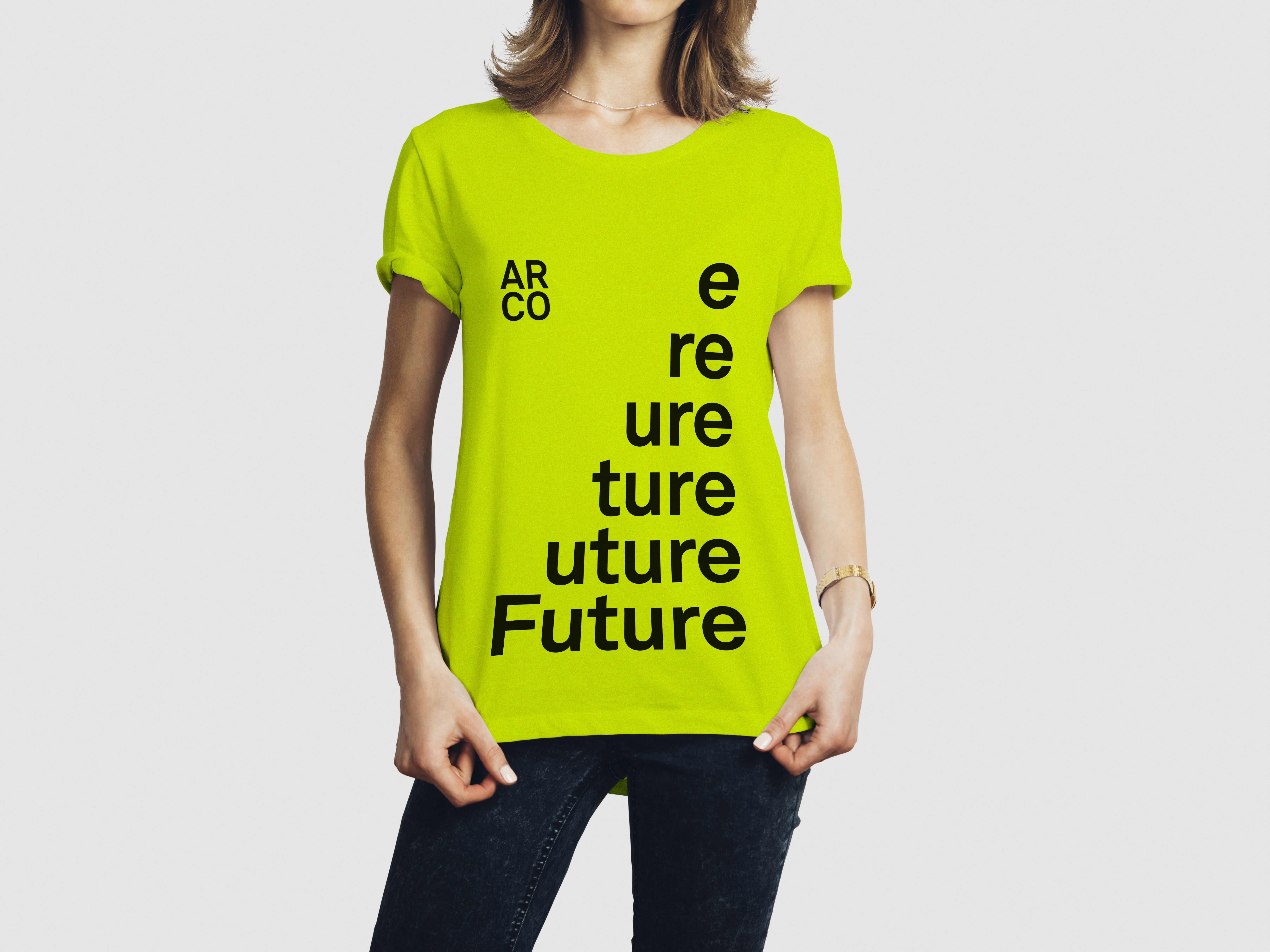
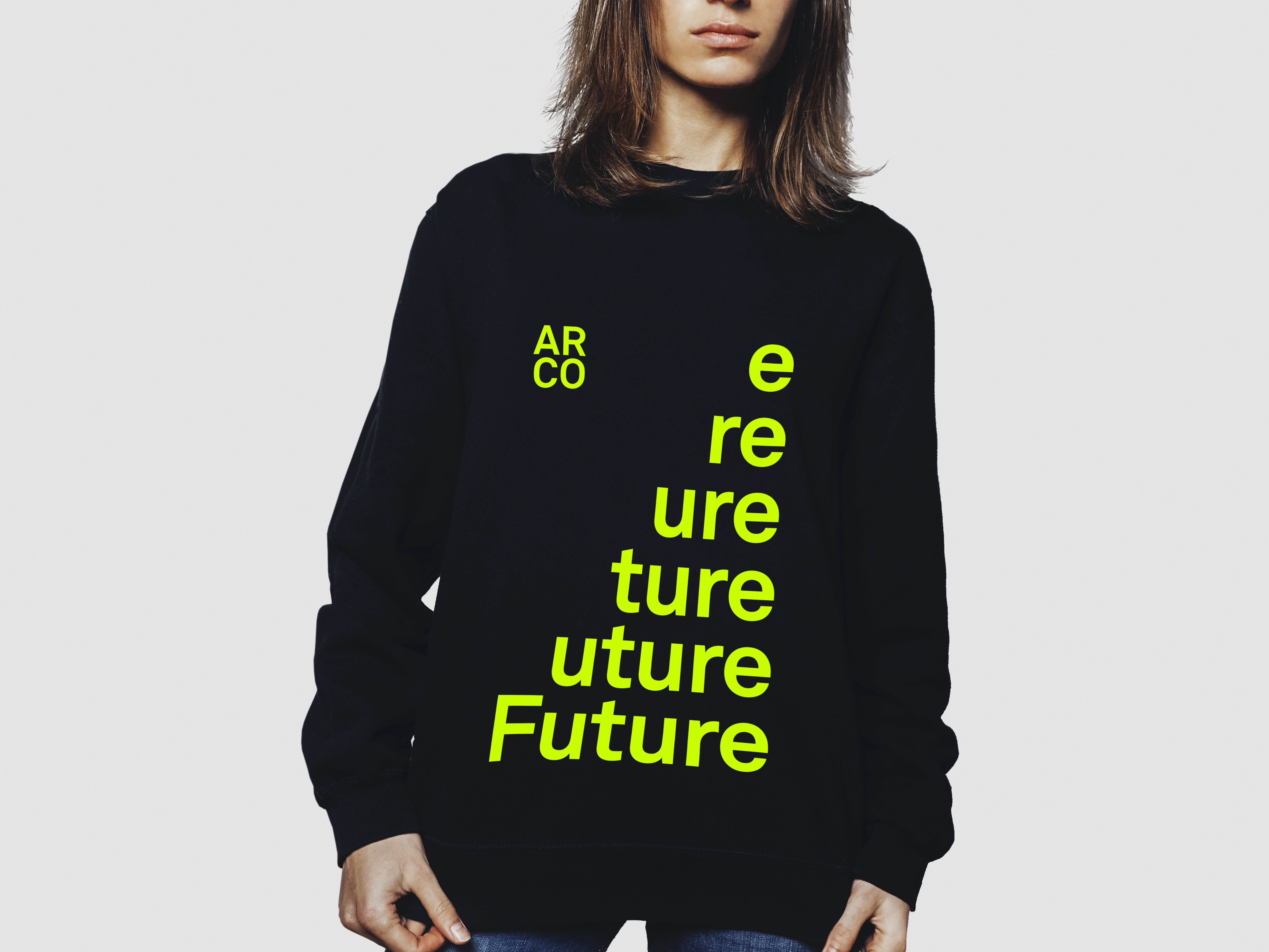
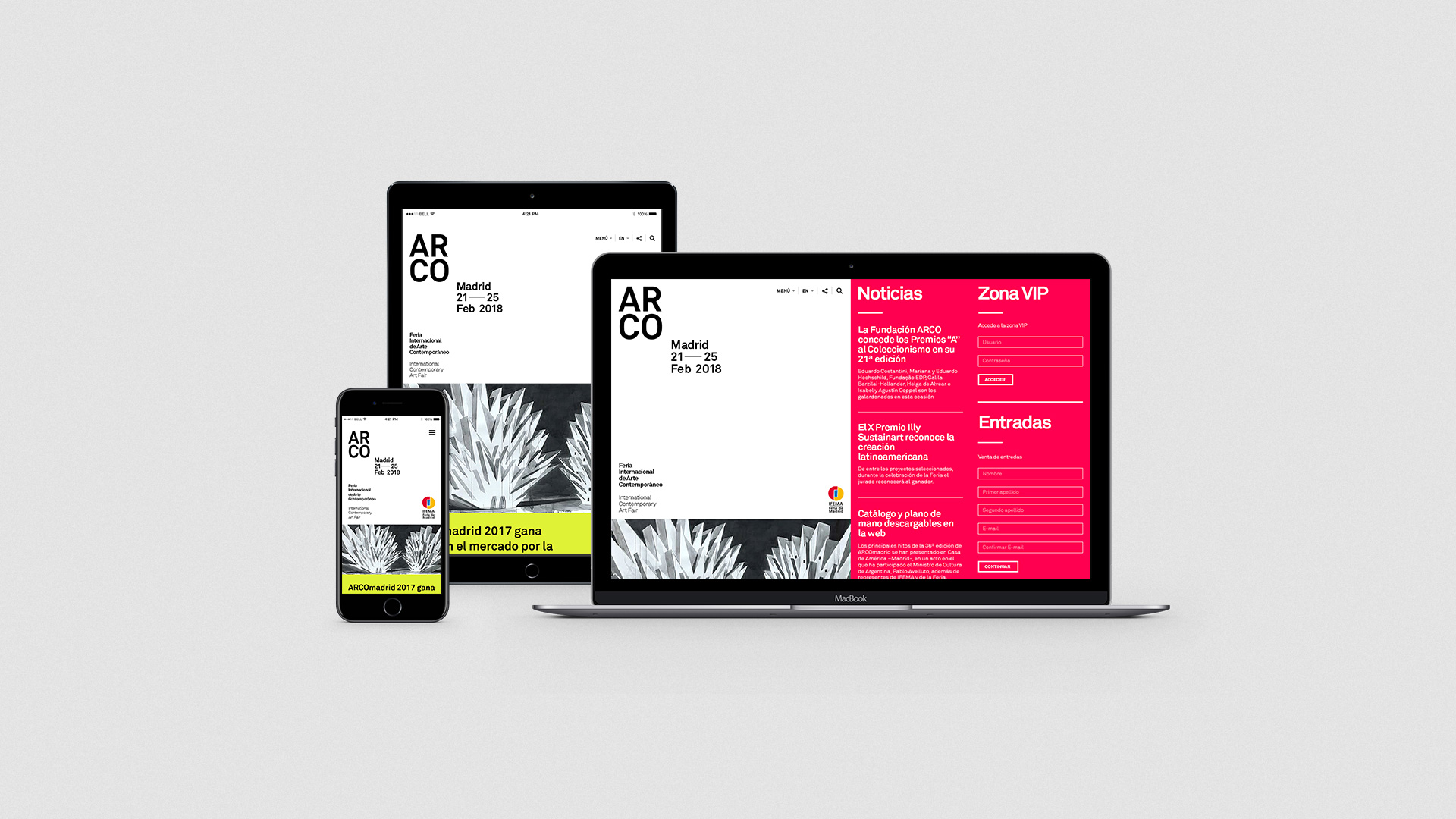
A visual identity system composed of a series of central elements that come together to create a solid and timeless structure with the main objective of establishing a clear and defined brand identity. Easy to recognise at a simple glance any ARCO communication.

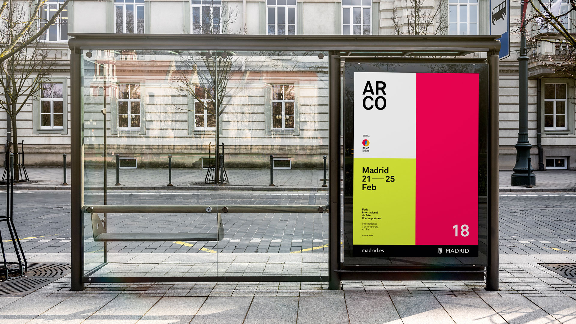

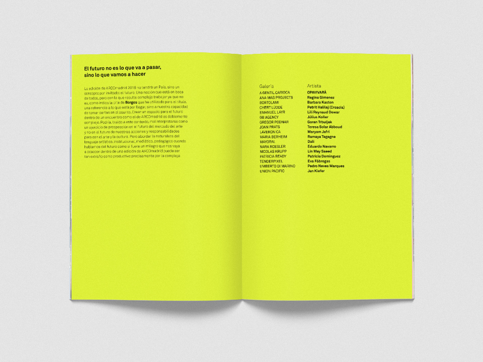
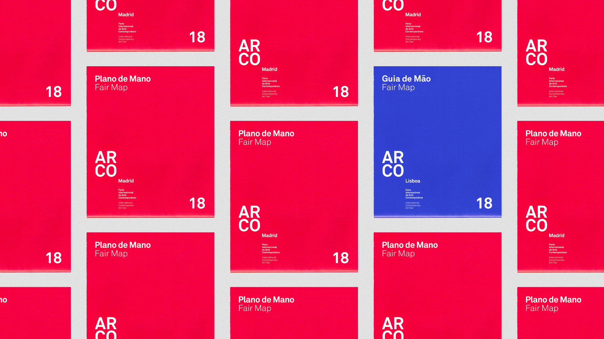
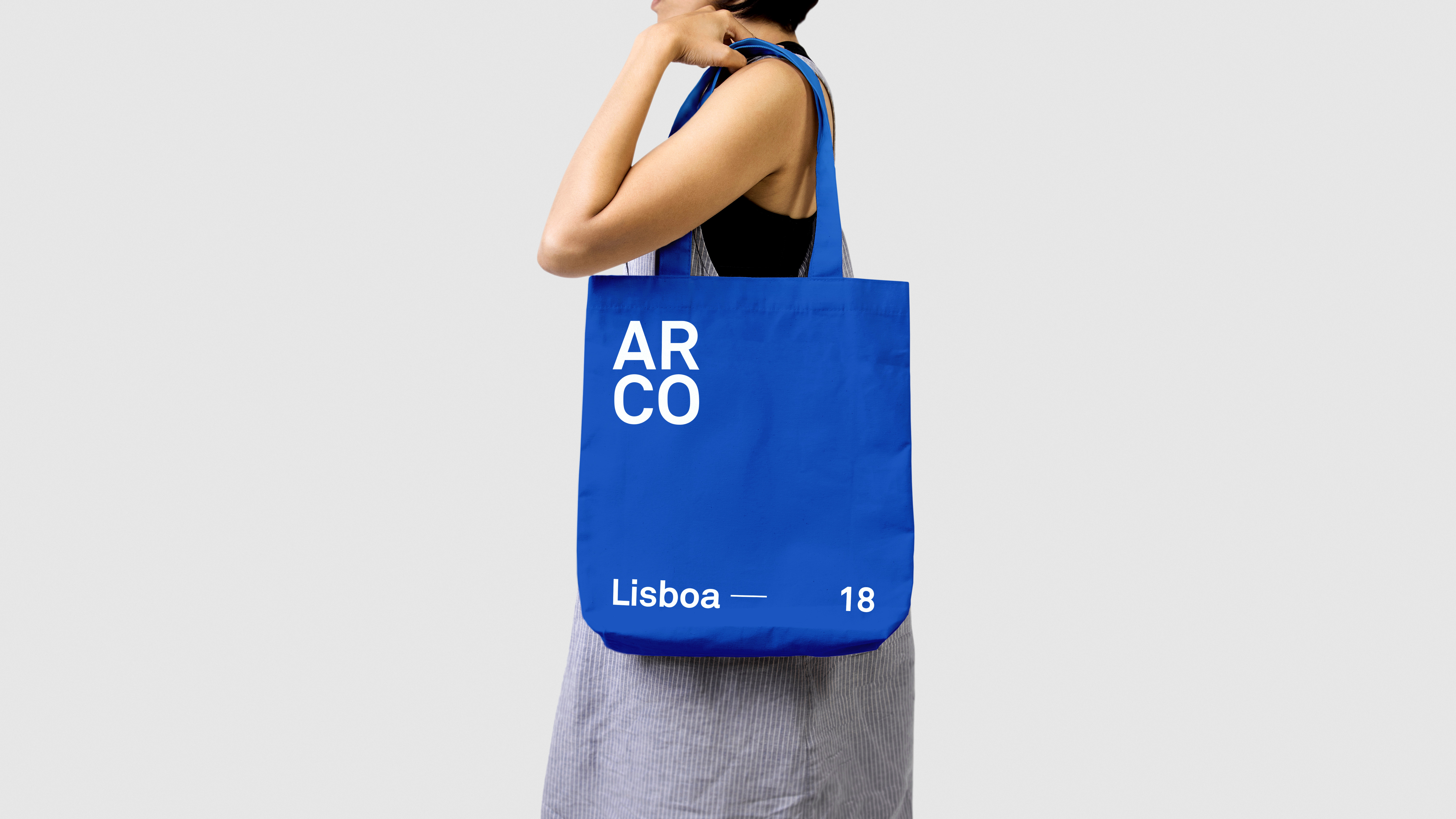
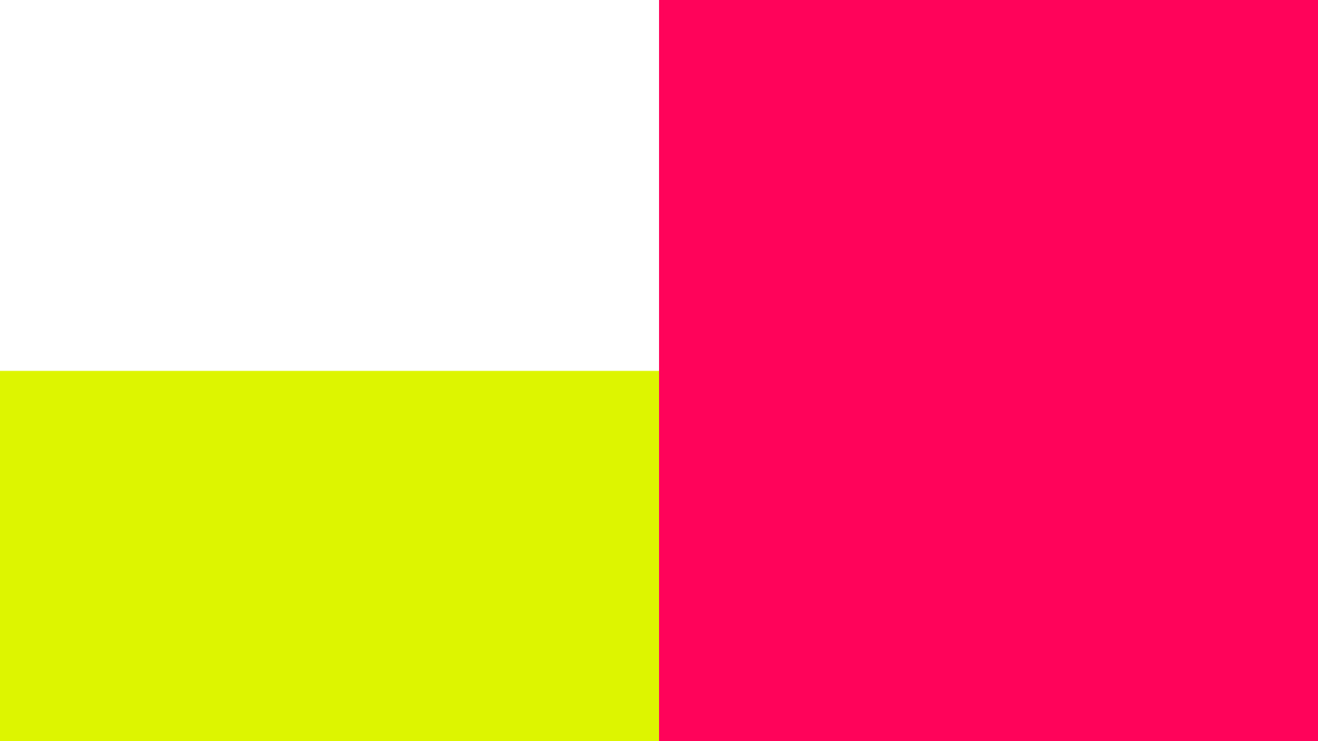
Color strategy
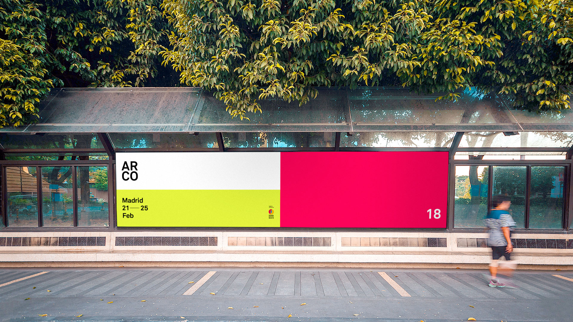
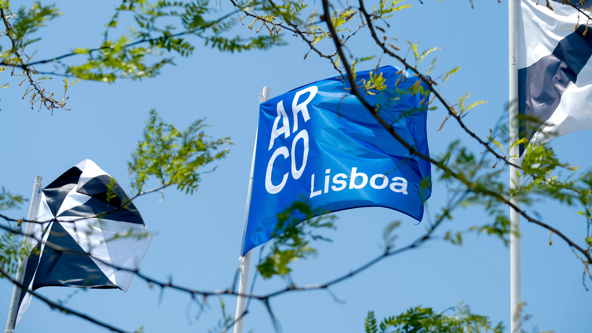
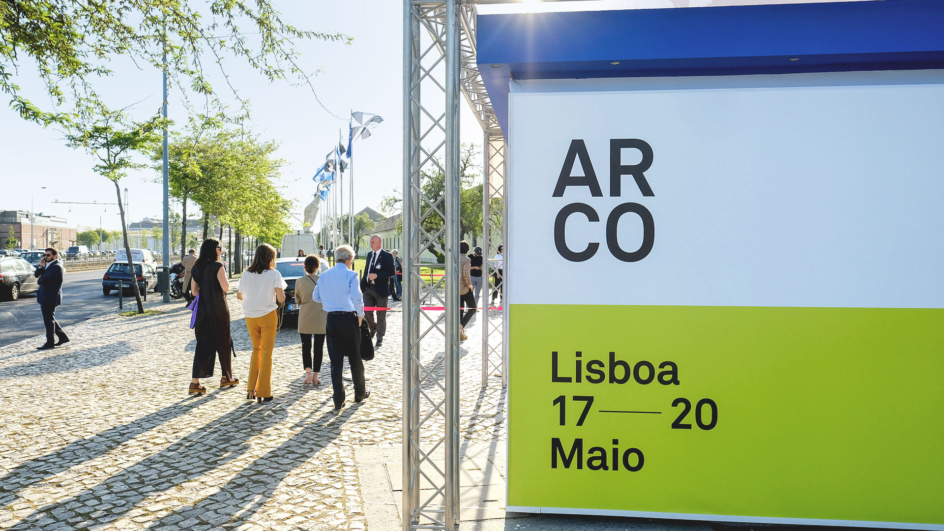
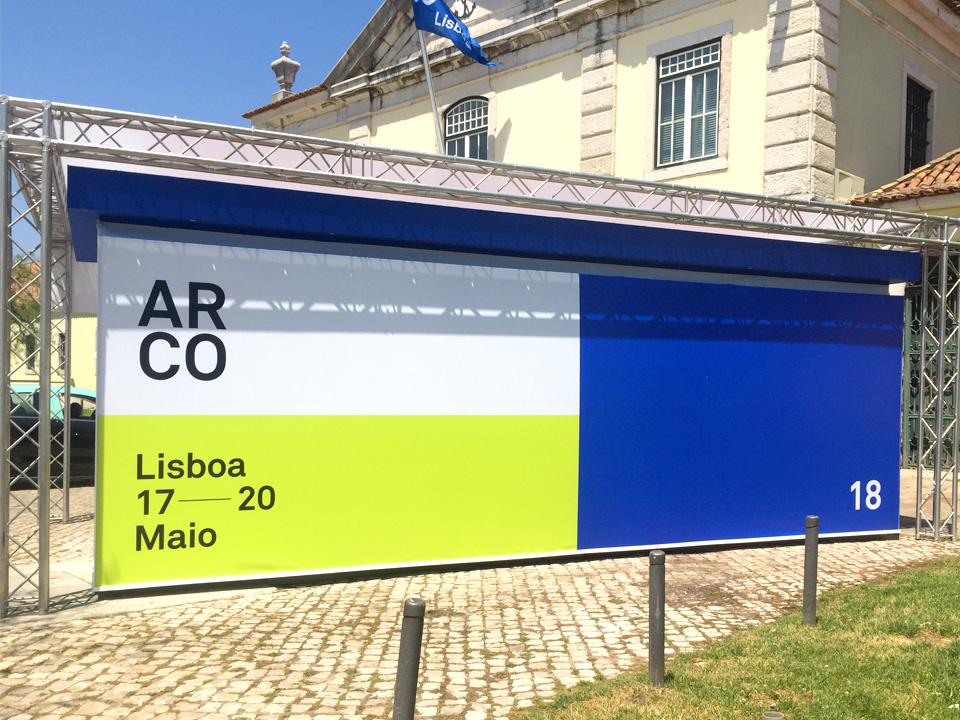
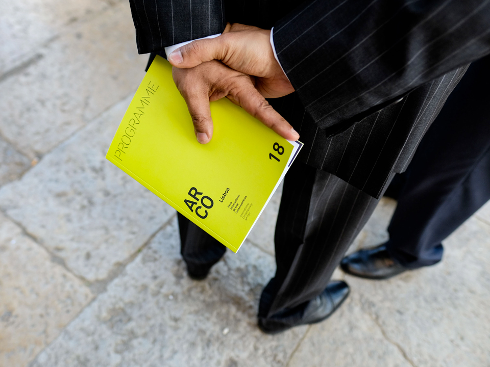
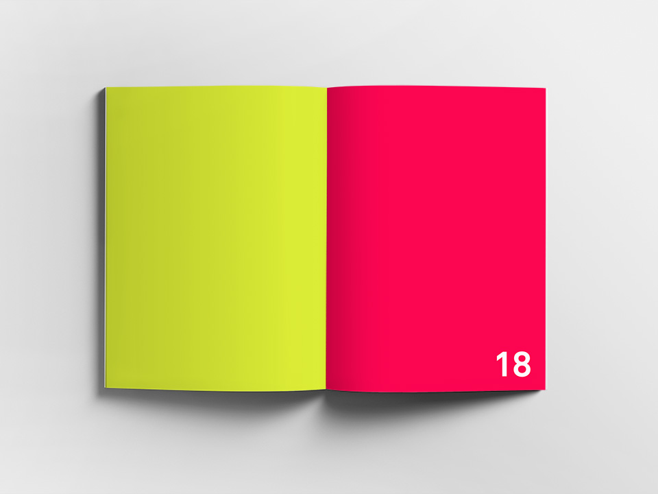
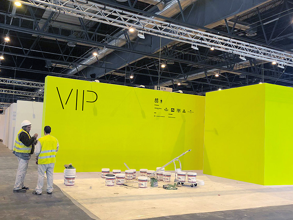
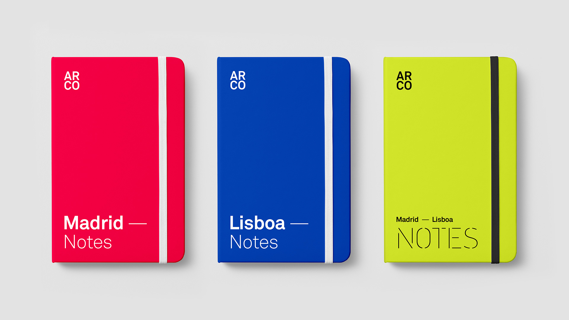
Color is one of the central elements within the identity, responsible for differentiating between years and between locations. Used within a dynamic and flexible grid applicable to print, digital and audiovisual media; It is the visual element that allows ARCO to be easily recognisable with or without the presence of the logo.
