Enaire
Identity and visual language
The air navigation manager in Spain and Western Sahara. Enaire controls the fourth largest airspace in Europe by volume of air traffic. Transporting over 200 million passengers per year.
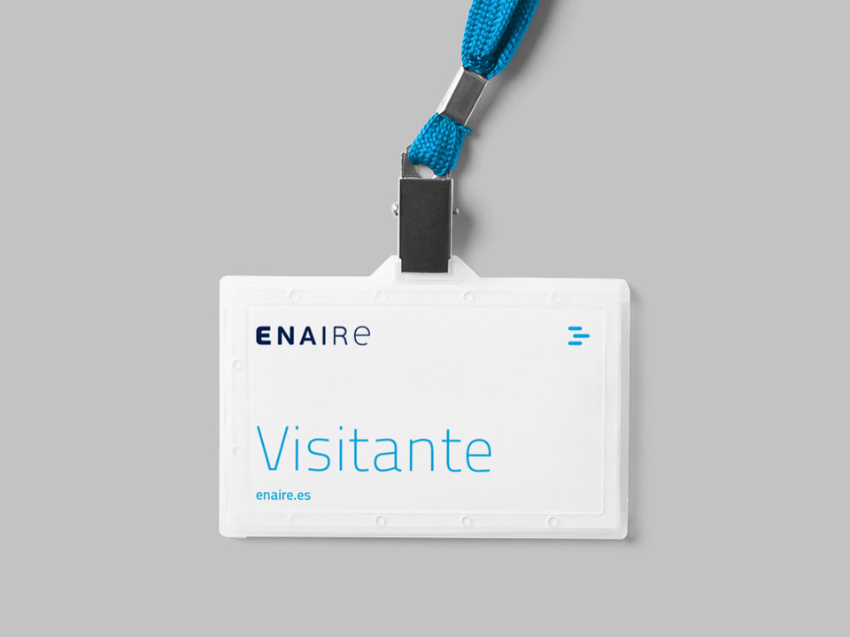
The work in branding, identity, and visual language carried out in the creation of the new brand is born out of an analysis of the brand’s values and attributes, which has resulted in a solid identity, coherent, easy to apply and built to last the test of time.

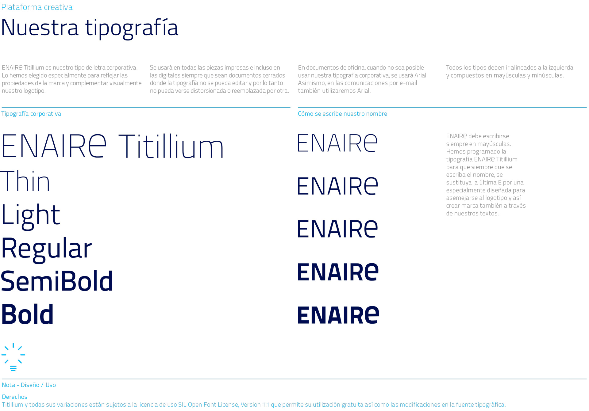
We created a typographic structure for the logo that would endow it with meaning. With the concept of ‘flow’ as a basis, the typography becomes air. We modified the last “E”, developing a new character.





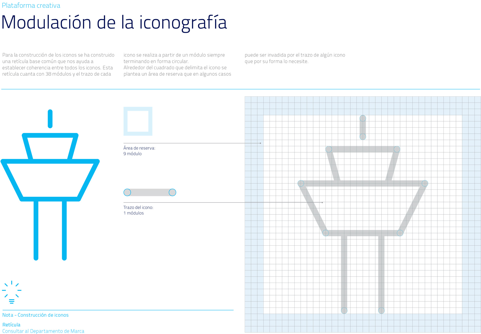
Together with the new brand, we developed an extensive manual with iconography, signage, infographics, stationery, publishing, audiovisual language, photographic style and digital media.


In order to create a differentiating element in the writing of the brand, we first choose Titillium typography and then we modified it, so that when writing the name in capital letters, the last “E” is replaced by a glyph based on the lower case “e”, created specifically for each weight. This allows the logo to become easily recognisable in the writing of emails, letters, etc.

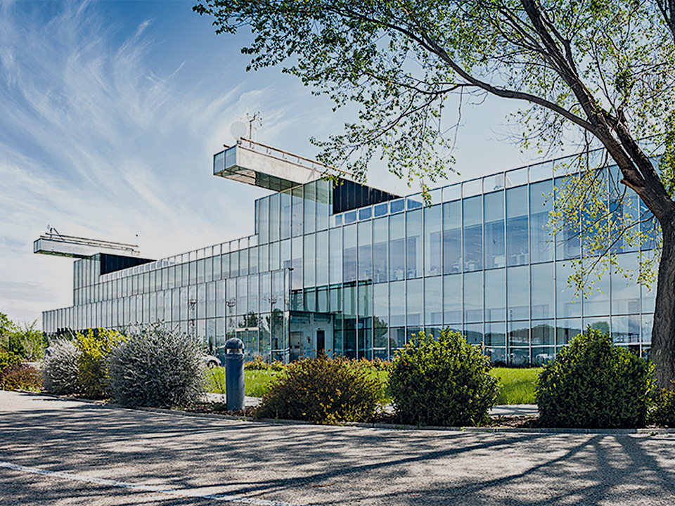


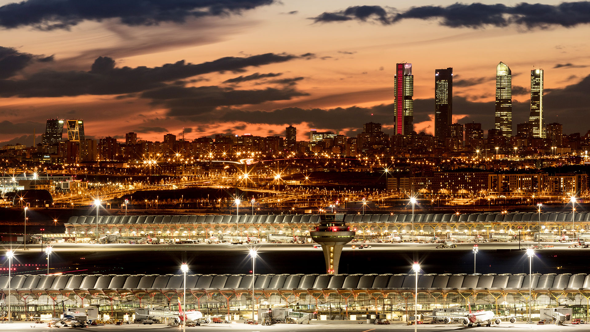
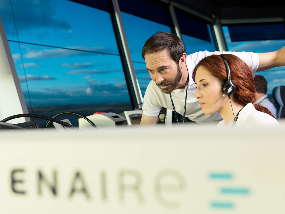
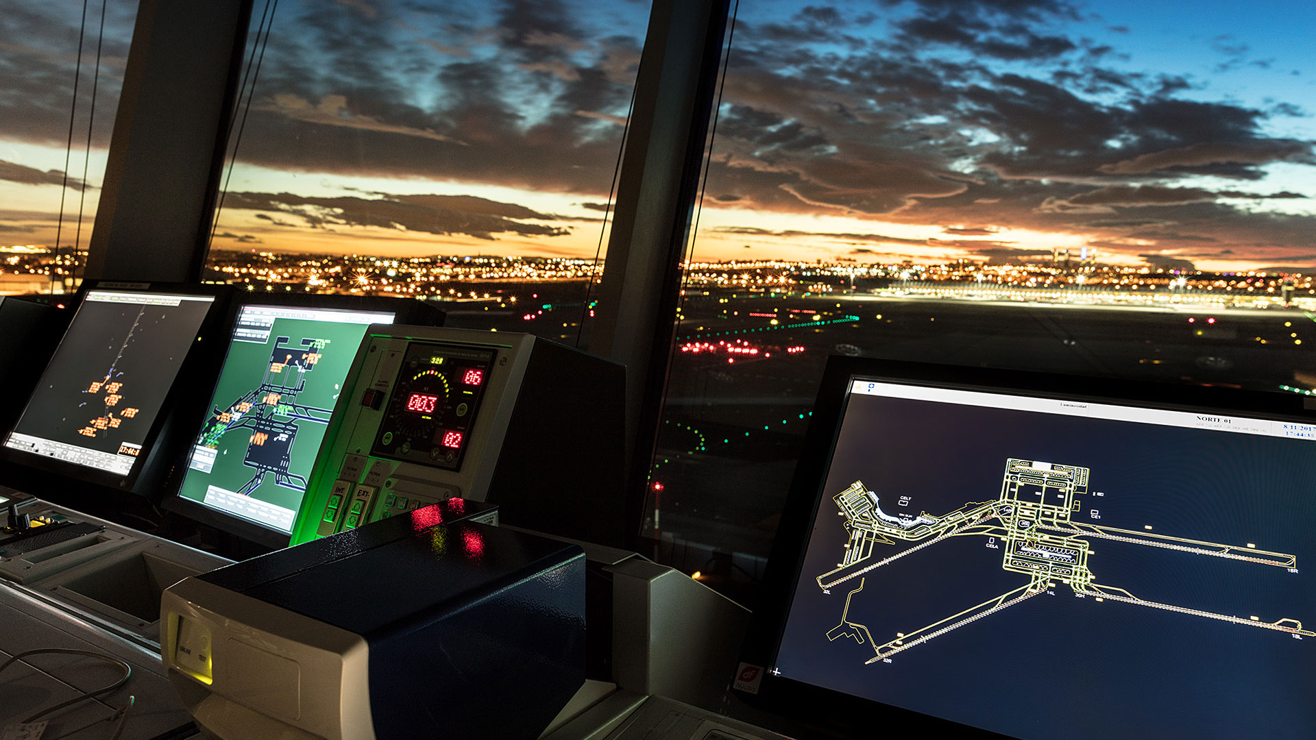
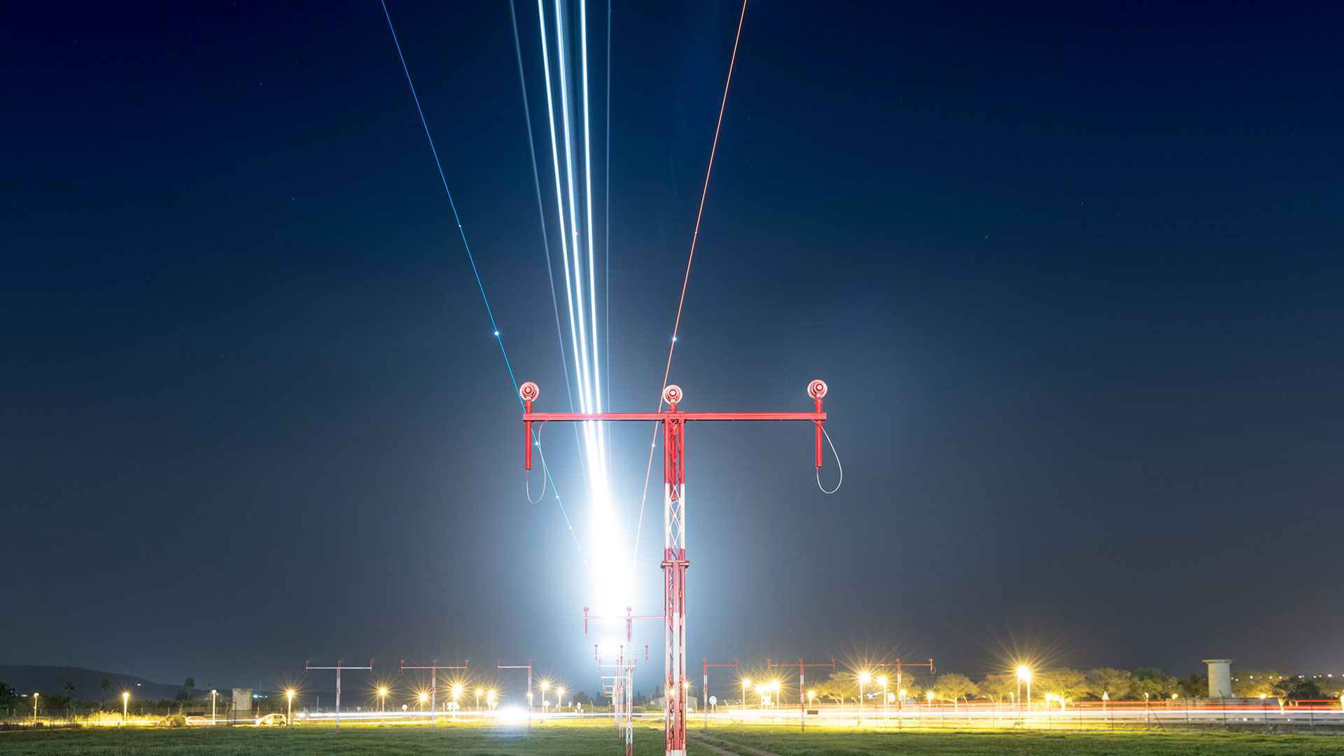
As part of the brand’s visual language, a photographic archive is being developed, which, following the style marked, documents the company’s infrastructure and personnel, to be used in all types of communications.
